Infusing Ancient Greek Philosophy into Mindful Indulgence
SERVICESCreative Direction Identity Packaging Design
TOOLSPhotoshop Illustrator
THE CHALLENGENavigate the delicate balance between sustainability and functionality in crafting a brand identity. Confront the challenge of designing packaging that is both recyclable and minimalist, while also incorporating individual wrapping to promote mindful consumption of the chocolate pieces. Strive to find innovative solutions that uphold my commitment to environmental responsibility without compromising on the packaging's effectiveness or visual appeal.
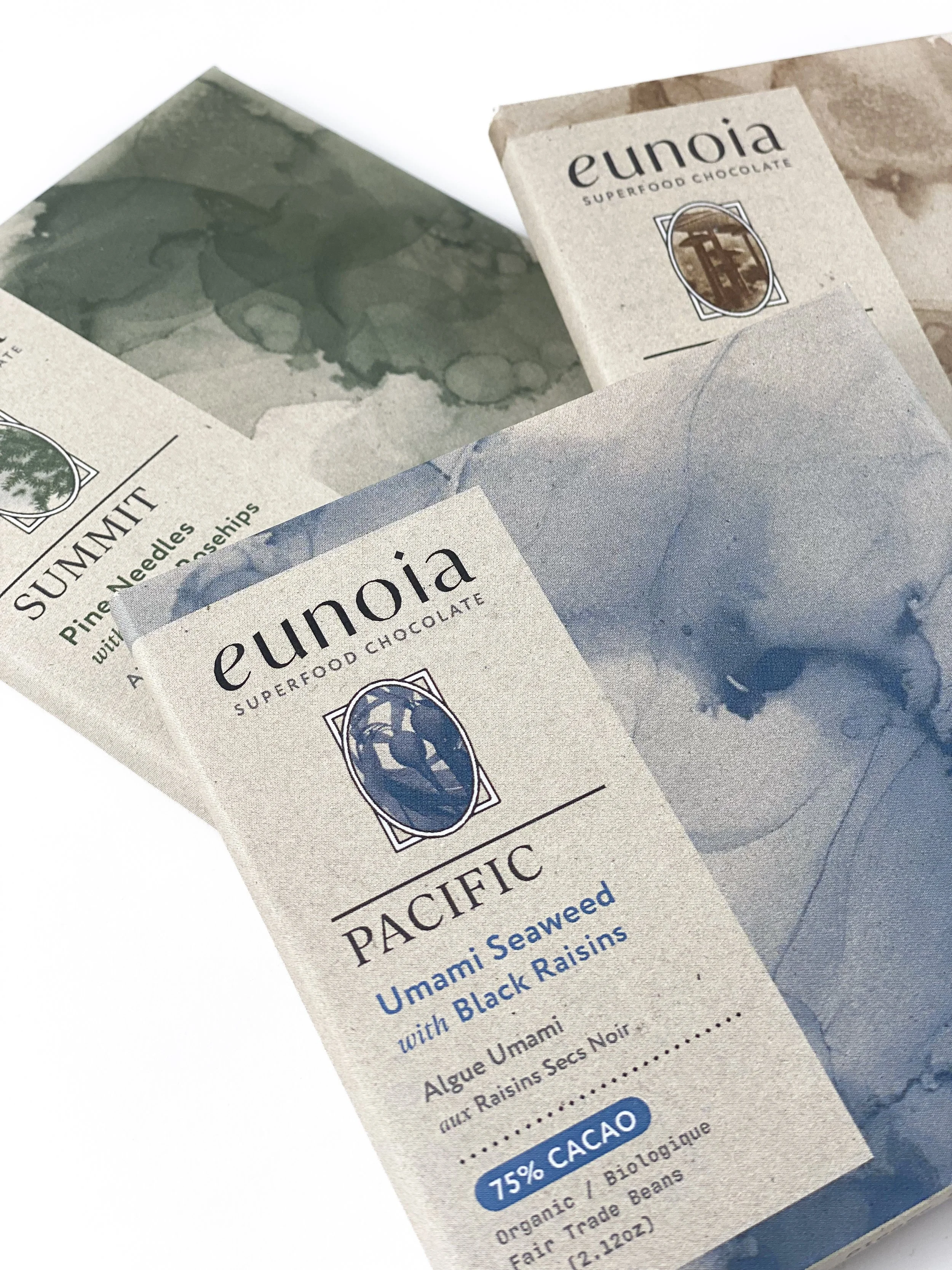
Front design of packaging.
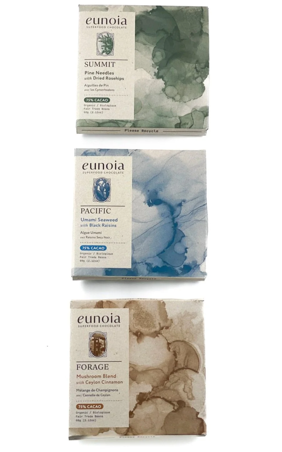
Three different variations.
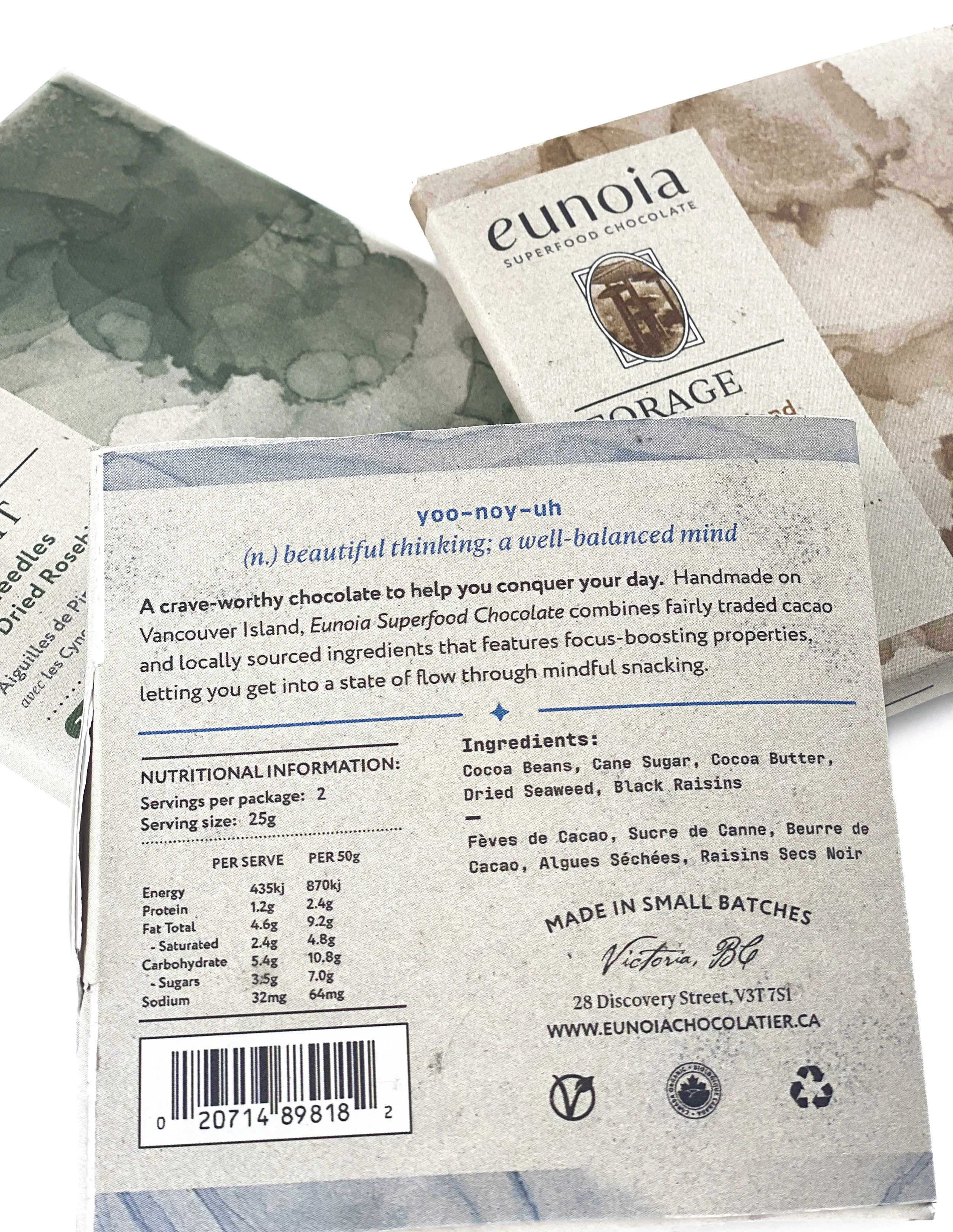
Back design of packaging.

Definition of the Greek term ‘Eunoia’ and name of the Superfood Chocolate brand.
THE APPROACHI crafted the identity of ‘Eunoia,’ a Superfood Chocolate brand inspired by its Greek namesake meaning ‘well mind; beautiful thinking.’ The brand revolves around the belief that what we consume internally reflects outwardly.
— Each chocolate bar is squared, symbolizing balance, with individually wrapped pieces inside to encourage mindful consumption.

Initial sketches and digital experimentations at the early stages of the project.
THE RESULTIn designing Eunoia’s packaging, I focused on three core values: environmental commitment, heritage, and innovation. I ensured the packaging seamlessly fits into boutique stores while still standing out in grocery stores through minimalist colours and typography. Hand-crafted illustrations and eco-friendly materials convey the handmade quality of the chocolates, with affirmations on the packaging reinforcing the brand’s message.
