Reconnecting with Your Inner Child through Frozen Delights
SERVICESCreative Direction Identity Packaging Design
TOOLSPhotoshop InDesign Illustrator Procreate
THE CHALLENGEDesign a print and email newsletter that communicates the brand identity effectively while engaging the audience. Ensure a cohesive visual experience across both mediums, maintaining clear and consistent branding elements. The newsletter should reflect the company’s values, tone, and aesthetic, while delivering valuable content across four sections.
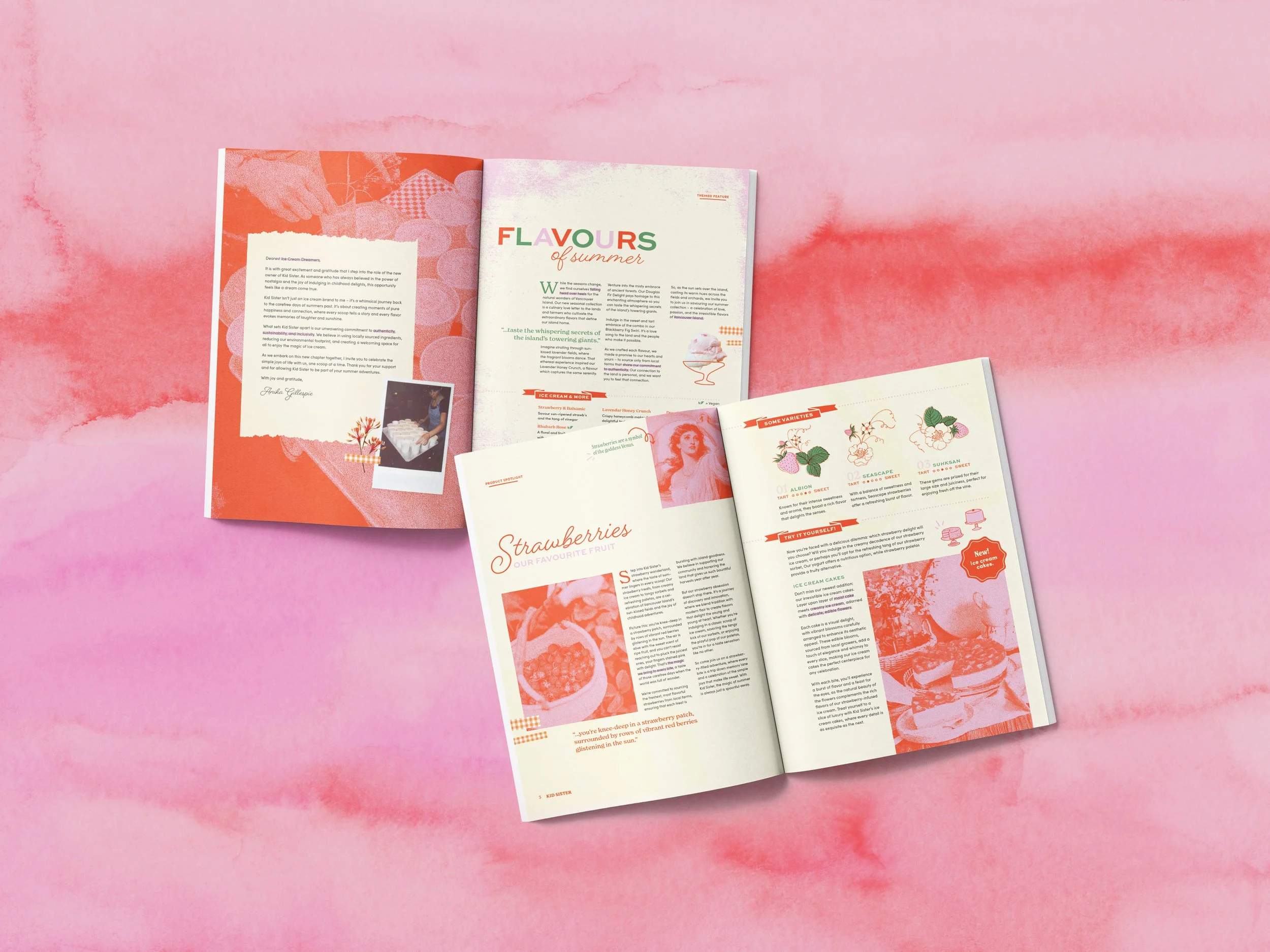
First and second spreads of the newsletter.

Moodboard for Kid Sister, with film photography, loose illustrations, and gingham patterns.
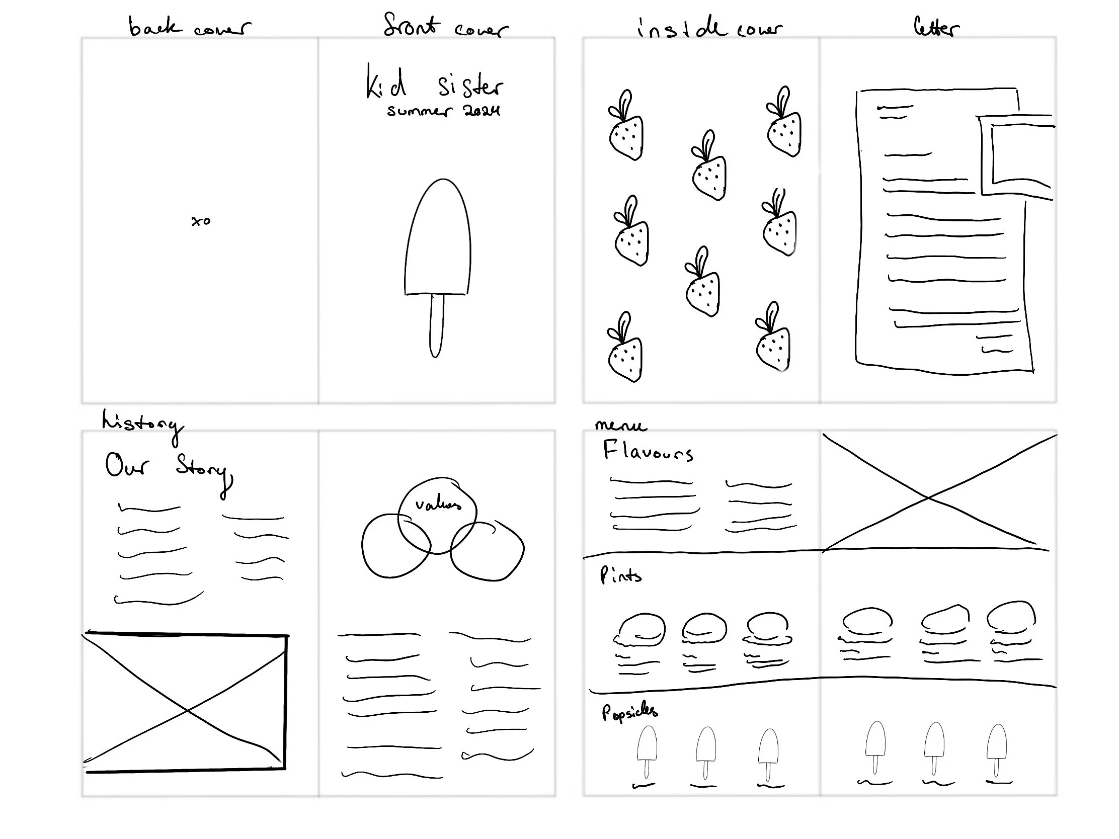
Initial layout sketches for the print newsletter.
THE APPROACHI first conducted a brand analysis on Kid Sister, uncovering their mission to reawaken the inner child with seasonal organic ingredients sourced from family-owned farms. From this analysis, I created a moodboard to capture the essence of Kid Sister’s warm and inviting branding, incorporating pale yellow, green, and orange hues and child-like illustrations.
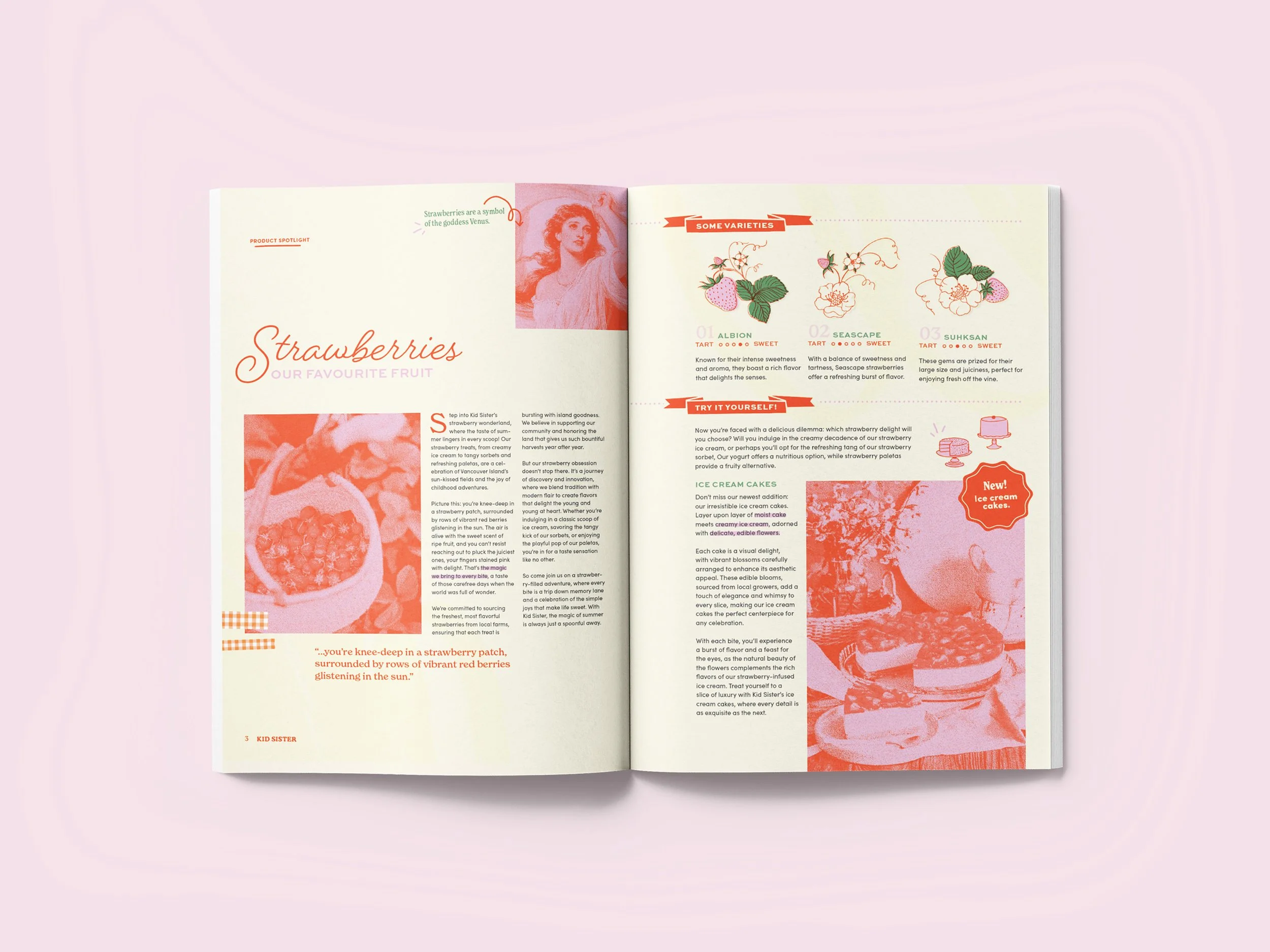
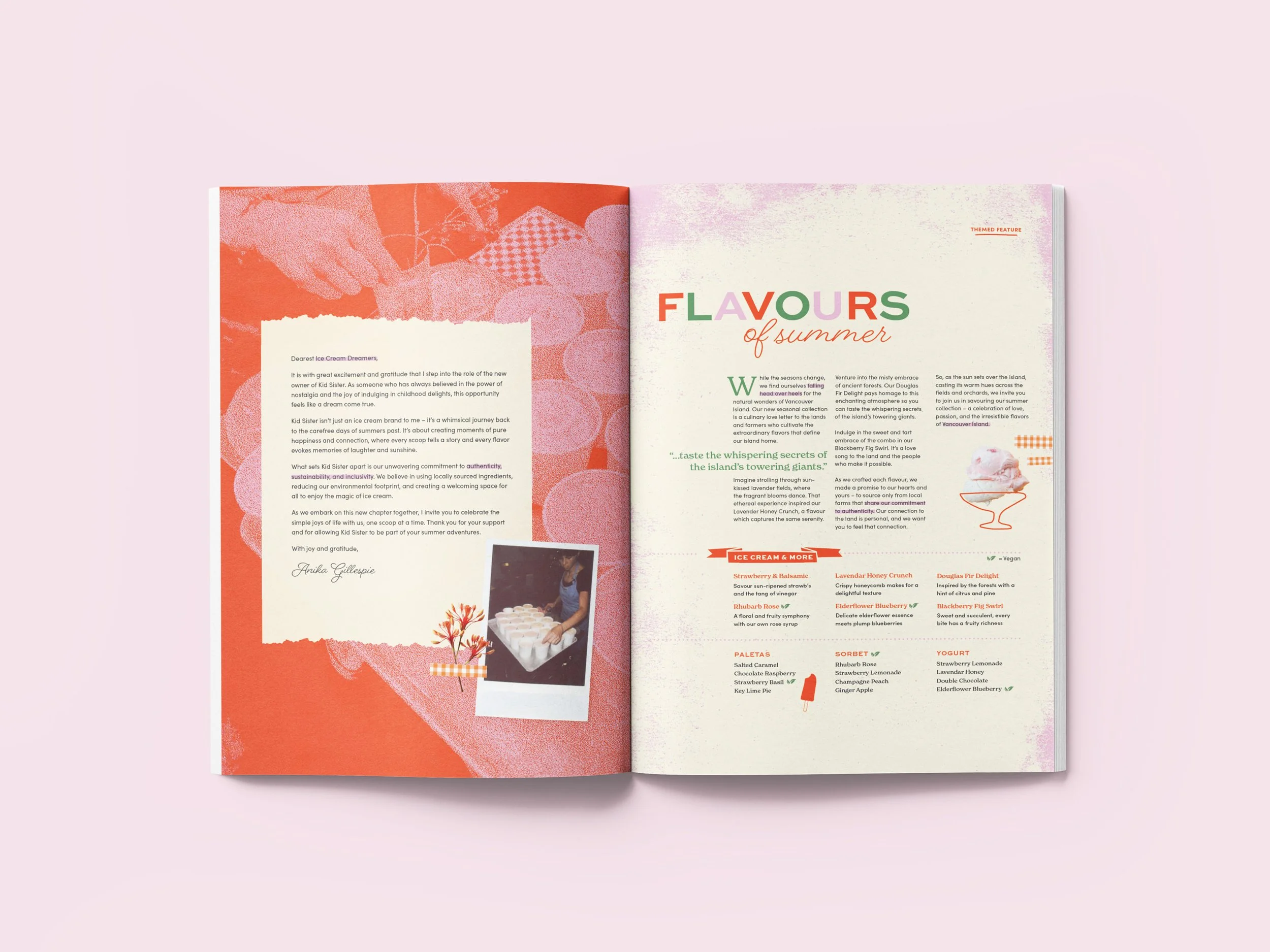
THE RESULTIllustrations were kept simple utlizing a monoline style, with four main typefaces incorporated, including a vintage baker-inspired font and a handwritten script. There are halftone texturized photographic visuals in a punchy pink and orange for a summer vibe, and quirky elements were added, such as gingham patterns, banners, and polaroids to enhance the brand’s fun and carefree image.
— Despite the playful content, I still aimed to maintain clarity and consistency through carefully arranged layouts in a grid structure.

Illustration for the newsletter’s cover.
-
![]()
Ingredient Feature
-
![]()
Map and Reviews
-
![]()
History and Flavours

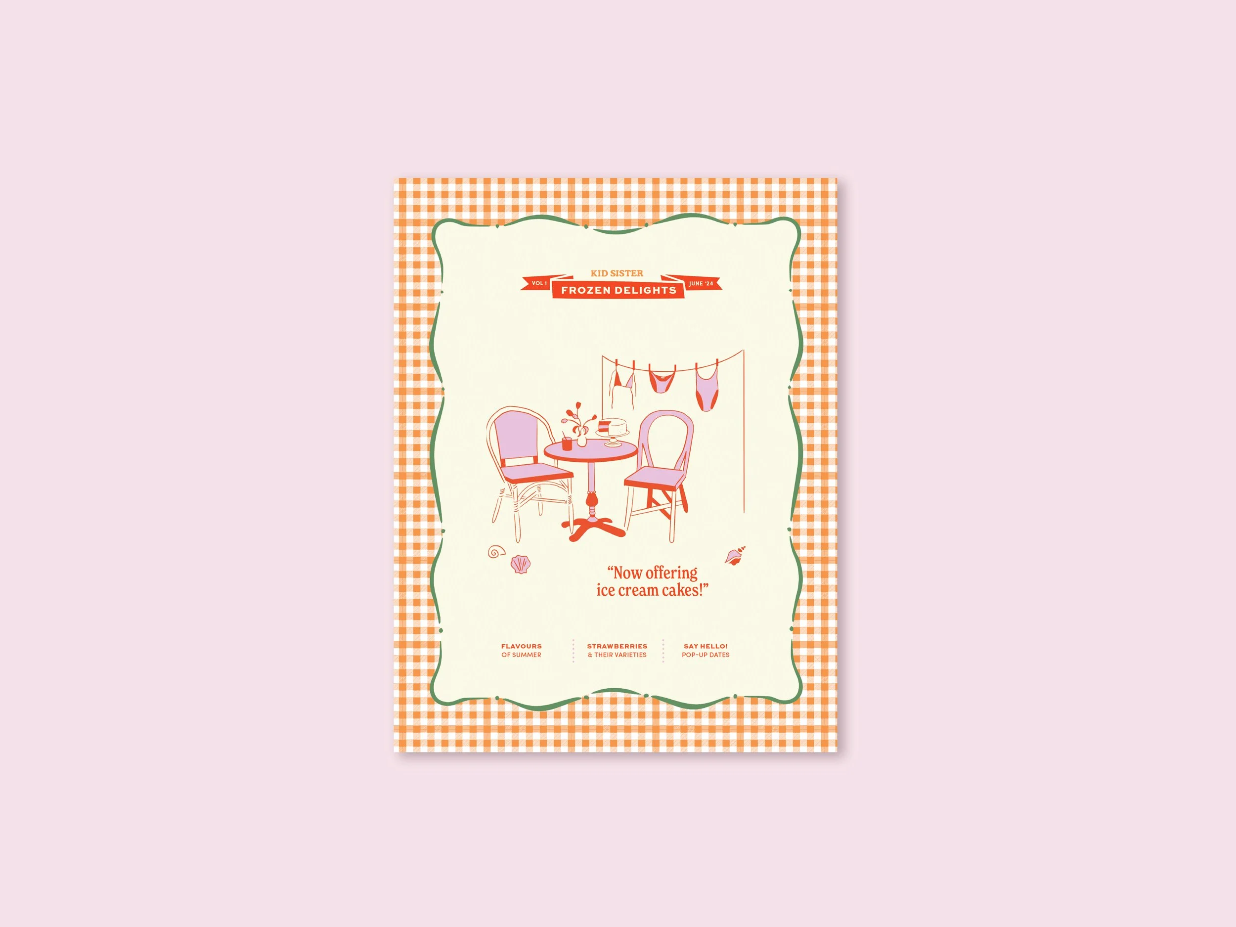
Front cover of the newsletter.